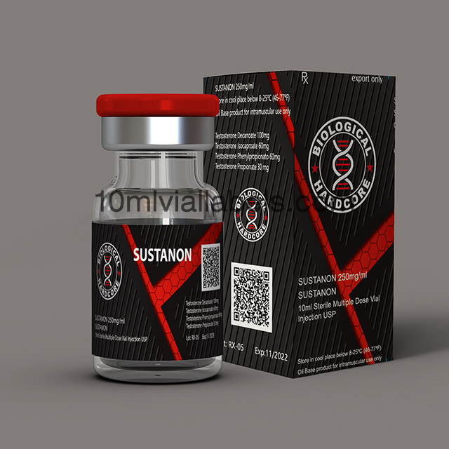
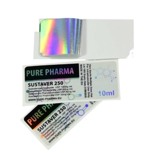
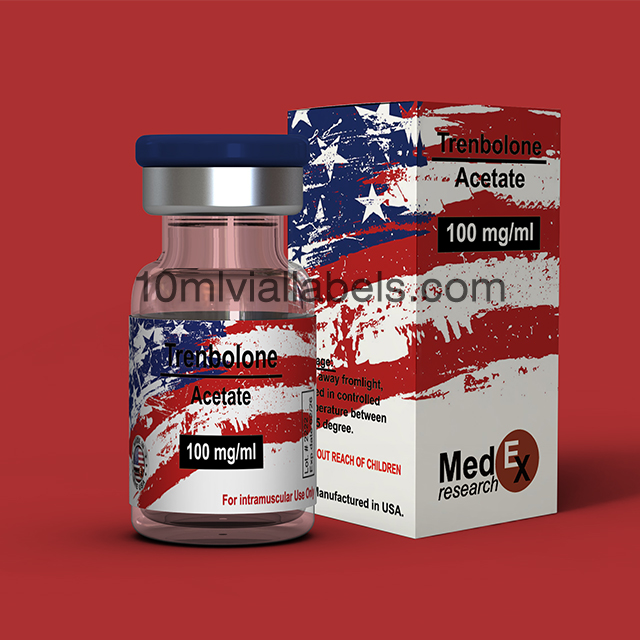
Safeguard Your Sust 250 with Premium Quality Labels
Our premium quality vial labels offer the perfect solution to safeguard your medication, ensuring its potency and effectiveness remain intact.
Reliable adhesive: Our labels feature a strong adhesive that adheres firmly to the vial, guaranteeing that the label won’t peel off or fade over time.
Resistant to external factors: Shield your Sust 250 vials from moisture, light, and other environmental factors that could potentially compromise the quality of your medication.
Clarity and readability: The high-quality print on our vial labels ensures that the important information, such as dosage and expiration date, is clear and easily legible.
FDA compliant: Rest easy knowing that our vial labels meet strict FDA regulations and guidelines, ensuring the safety and integrity of your medication.
Peace of mind: By using our vial labels, you can confidently manage your Sust 250 inventory, minimizing the risk of errors and maximizing your peace of mind.
Understanding the Importance of Packaging Design
Packaging design plays a vital role in attracting customers and creating a lasting impression. It serves as a visual representation of a brand’s identity, values, and product quality. Effective packaging design can communicate a brand’s message, evoke emotions, and differentiate a product from its competitors. When it comes to vial boxes, the design becomes even more crucial as it directly influences the perceived value and trustworthiness of the enclosed product.
Exploring the Significance of Colors in Packaging
Colors have a profound psychological impact on individuals, influencing their emotions, perceptions, and behaviors. Understanding the symbolism and associations of different colors is essential for effective packaging design. In the context of black and red design, both colors carry unique meanings and evoke distinct emotional responses.
Psychological Impact of Colors
Color psychology reveals that different colors can evoke specific emotions and trigger certain responses. Black and red are particularly powerful colors that captivate attention and stimulate a wide range of feelings.
Black Color Symbolism
Black is often associated with elegance, sophistication, and power. It exudes a sense of mystery and exclusivity, making it a popular choice for luxury brands. Additionally, black signifies strength, authority, and a sense of timelessness. However, it is essential to strike a balance when using black in packaging design, as too much black can create a gloomy or somber impression.
Red Color Symbolism
Red is a color that demands attention. It is associated with passion, energy, and excitement. Red can evoke strong emotions and stimulate appetite and impulse, making it a popular choice for food and beverage packaging. It also symbolizes love, power, and urgency. However, excessive use of red can create a sense of aggression or danger, so it is crucial to use it strategically in packaging design.

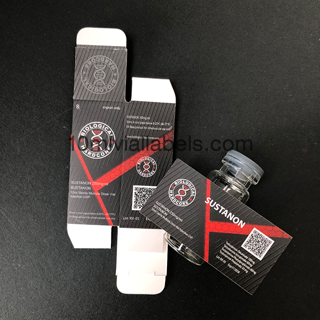
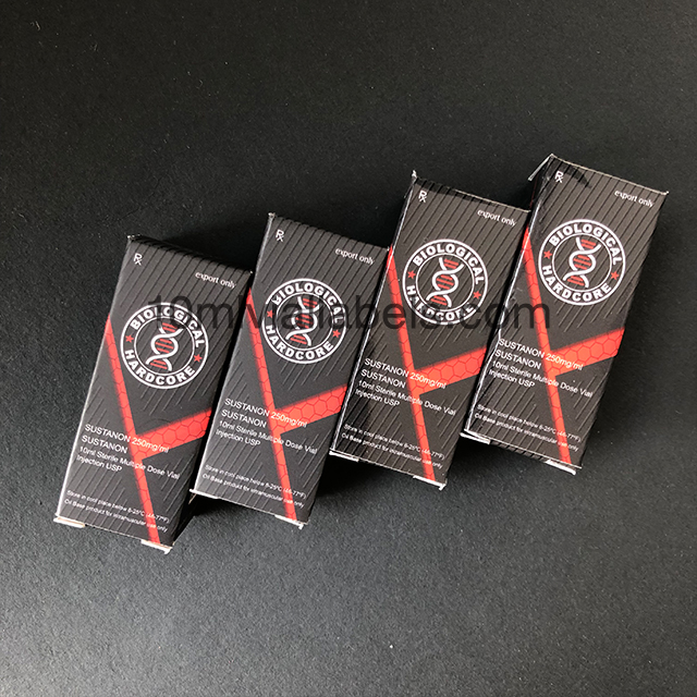
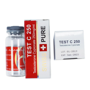
Black and Red Design in Vial Boxes
The combination of black and red in vial boxes creates a visually striking contrast that instantly captures attention. This color duo has the power to evoke a sense of elegance, sophistication, and excitement. Let’s explore how black and red designs can be effectively utilized in vial boxes.
1. Black and Red Combination: A Powerful Contrast
The juxtaposition of black and red creates a strong visual impact. The deep richness of black combined with the vibrancy of red generates a compelling contrast that draws the eye. This contrast is particularly effective in vial boxes, as it enhances the visibility of the product and makes it stand out on the shelves.
2. Creating Visual Appeal with Black and Red
Black and red designs in vial boxes can add a touch of sophistication and glamour to the packaging. The sleekness of black combined with the boldness of red creates a visually appealing package that exudes a sense of luxury. It gives the impression of a high-quality product and can attract customers who value elegance and style.
3. Conveying Brand Identity and Values
The color combination of black and red can also be used to reinforce a brand’s identity and values. For example, a brand that wants to communicate power and authority can use a predominantly black vial box with red accents. On the other hand, a brand aiming to convey passion and energy can opt for a predominantly red box with a black design.
When incorporating black and red into vial box design, it is important to consider the following factors to convey brand identity and values:
a) Brand Image: The use of black and red can align with a brand’s desired image. For instance, a brand targeting a youthful and energetic audience may choose vibrant red as the dominant color, while a brand focusing on elegance and sophistication might opt for a black background with subtle red accents. The color combination should reflect the essence of the brand and resonate with its target audience.
b) Brand Values: Colors have the power to evoke emotions and associations. By leveraging the symbolism of black and red, brands can communicate their core values effectively. For example, a brand emphasizing passion, power, and excitement can utilize red prominently, while a brand that emphasizes strength, authority, and timelessness may lean more toward black.
c) Consistency: Consistency in branding is crucial for establishing a strong brand identity. The use of black and red in the vial box design should align with other brand elements such as logo, typography, and overall visual identity. This consistency creates a cohesive brand experience and helps consumers recognize and connect with the brand across different touchpoints.
d) Differentiation: In a crowded market, differentiation is key to standing out from competitors. Black and red designs in vial boxes can provide a unique visual identity that sets a brand apart. By carefully considering the balance between black and red elements, typography, and graphics, brands can create a distinctive packaging design that catches consumers’ attention and leaves a lasting impression.
e) Cultural Relevance: It’s essential to be mindful of cultural connotations associated with colors. While black and red may carry certain meanings in one culture, they could have different interpretations in another. Brands should consider their target market’s cultural background and ensure that the use of black and red aligns with their preferences and avoids any unintended negative associations.
By strategically incorporating black and red designs in vial boxes, brands can effectively convey their identity and values to consumers. The color combination, when used thoughtfully and consistently, creates a memorable visual impact that helps the brand establish a strong presence in the market.
![]()
Order Process

Payment

Logistics and Transportation

Reviews
There are no reviews yet.