
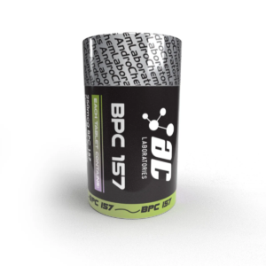
Why choose black and white in the pharma design ?
Perceptions and Trust
Perceptions can make or break a pharmaceutical company. The visual appeal of packaging, promotional materials, and even online presence shapes how stakeholders perceive a brand. Black and white design, with its classic and clean aesthetic, fosters a sense of trust and credibility.
Regulatory Compliance
Navigating the labyrinth of regulatory requirements is a challenge for pharmaceutical companies. Design elements must align with strict guidelines without compromising on creativity. Black and white design, with its inherent simplicity, seamlessly integrates with regulatory standards.
Accessibility and Clarity
Accessibility is a cornerstone of effective communication in the pharmaceutical sector. Black and white design, with its high contrast, enhances readability and ensures that crucial information is easily discernible. Clarity in communication is non-negotiable when dealing with healthcare-related content.
Cultural Considerations
The pharmaceutical market is global, and cultural nuances must be considered in design choices. Black and white, being culturally neutral, transcends geographical boundaries, making it a versatile choice for a diverse audience.
Trends and Timelessness
Design trends in the pharmaceutical industry evolve, but some principles remain timeless. Black and white design, while aligning with contemporary aesthetics, possesses a timeless quality that outlasts fleeting trends, ensuring longevity in brand representation.
Case Studies
Let’s explore real-world examples of pharmaceutical companies that have successfully embraced black and white design, reaping the benefits in terms of brand recognition, customer trust, and regulatory compliance.
Challenges and Considerations
While the merits of black and white design are evident, challenges may arise in its implementation. From potential monotony to issues of visual hierarchy, we address these challenges and provide insights into overcoming them without compromising on the essence of the design.
Future of Pharma Design
As technology advances and consumer expectations evolve, the role of design in the pharmaceutical sector is set to transform. We speculate on how black and white design may continue to play a pivotal role in shaping the visual landscape of pharmaceutical brands.
Expert Insights
Gain valuable insights from design experts in the pharmaceutical industry as they share their perspectives on the impact of black and white design on brand identity, consumer trust, and the overall visual language of the industry.
Reader Engagement
Your thoughts matter. Share your experiences and opinions on pharmaceutical design. How do you perceive black and white design in this context? We invite you to join the conversation and contribute to the evolving dialogue on design in the pharma business.

FAQs for black and white design.
Q1: Is black and white design suitable for all types of pharmaceutical products?
Yes, black and white design can be adapted to various pharmaceutical products, promoting a cohesive and professional brand image.
Q2: How does black and white design contribute to regulatory compliance?
The simplicity of black and white design aligns seamlessly with regulatory guidelines, ensuring that visual elements meet industry standards.
Q3: Are there instances where color is more advantageous than black and white in pharmaceutical design?
While black and white design offers universal appeal, certain instances may warrant the strategic use of color for specific marketing or branding purposes.
Q4: How can pharmaceutical companies maintain a balance between simplicity and creativity in design?
Achieving a balance between simplicity and creativity involves thoughtful design choices, strategic use of visual elements, and adherence to brand guidelines.
Order Process

Payment

Logistics and Transportation


Reviews
There are no reviews yet.